COLETTE
213 Rue Saint-Honore 75001 Paris
On a holiday in Paris I came across Colette, a design shop that open in 1997 which holds a variety of exsclucive item. I found the shop amazing and full of new design, it also has an art gallery on the top floor which hold diferent exhibitions.
Here are some of the products/designs you can find in the shop.
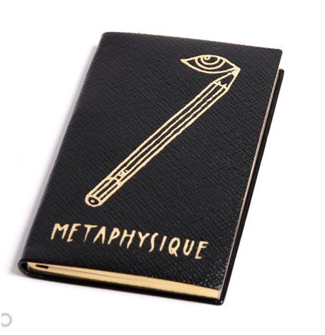
SMYTHSON, ANDRE, COLETTE
"Metaphsique" notebook
In 1887, Frank Smythson started a high quality eponymous stationery line using the highest quality leather.
Now found in Collette with titles and subtitles.
122 years ago these books were produced for the imperial Japanese family,
Governors from Bombay, Bengal and Madras.
"Metaphsique" notebook
In 1887, Frank Smythson started a high quality eponymous stationery line using the highest quality leather.
Now found in Collette with titles and subtitles.
122 years ago these books were produced for the imperial Japanese family,
Governors from Bombay, Bengal and Madras.


CHIKUNO
Air Freshener Cube
Air Freshener Cube

Third Draw Down
Stool
Stool

Platex
Keith Haring

KIKKERLAND
Camcorder key ring

The Cube Fontaine
By Claire Fontaine

AMBUSH, ZIPPO
lighter
lighter

PARIS FRIENDS
How To
Photography and type
I like the veriety of diferent layouts,fonts and colours.
I think it shows that you don't have to have one final poster if more than one works.
How To
Photography and type
I like the veriety of diferent layouts,fonts and colours.
I think it shows that you don't have to have one final poster if more than one works.


MIKE PERRY
I haven't ever added photography and illustration together and it is something that I would like to get in to.The images below are inspiring and creative.
I think Perry's work is individual and unusual which to me makes it eye catching
I haven't ever added photography and illustration together and it is something that I would like to get in to.The images below are inspiring and creative.
I think Perry's work is individual and unusual which to me makes it eye catching


I love fantasy lands and here Mike Perry has created a world that works but doesn't make sense.
i love how simple his work is and only uses outlines without shadings.
i love how simple his work is and only uses outlines without shadings.


MIKE PERRY
Mike Perry has really inspired me to look more in to type as image. His work is so creative and show how type can be illustrative and fun.
I recently bought some of his "iron me on" T-shirt transfers so that I can wear him work
Mike Perry has really inspired me to look more in to type as image. His work is so creative and show how type can be illustrative and fun.
I recently bought some of his "iron me on" T-shirt transfers so that I can wear him work


Paul Dallas
Beautiful type and image connected together with ink
Beautiful type and image connected together with ink


Design museum
designer of the year
Kam Tang
2006
Illustrations cut from laminated wall panels and reconfigured as a kinetic Mobile at the shows entrance.
joining type and images together.
designer of the year
Kam Tang
2006
Illustrations cut from laminated wall panels and reconfigured as a kinetic Mobile at the shows entrance.
joining type and images together.


 Strong bold type with soft images working behind the type
 lighter colour for background image making the type the main part of the poster.
 Illustrations also used at the cafe in the design museum, makes the exhibition carry on. I think it looks clever and draws your attention to sitting down and using the cafe.
SELF PORTRAIT by sALuUM
 I was captured by this images as it is made up from just text to create a self portrait of a man.
The colours are exciting and I think they create feeling coming out of the man.
The sizing and the change of font make the image and it is something I would like to learn.
No comments:
Post a Comment